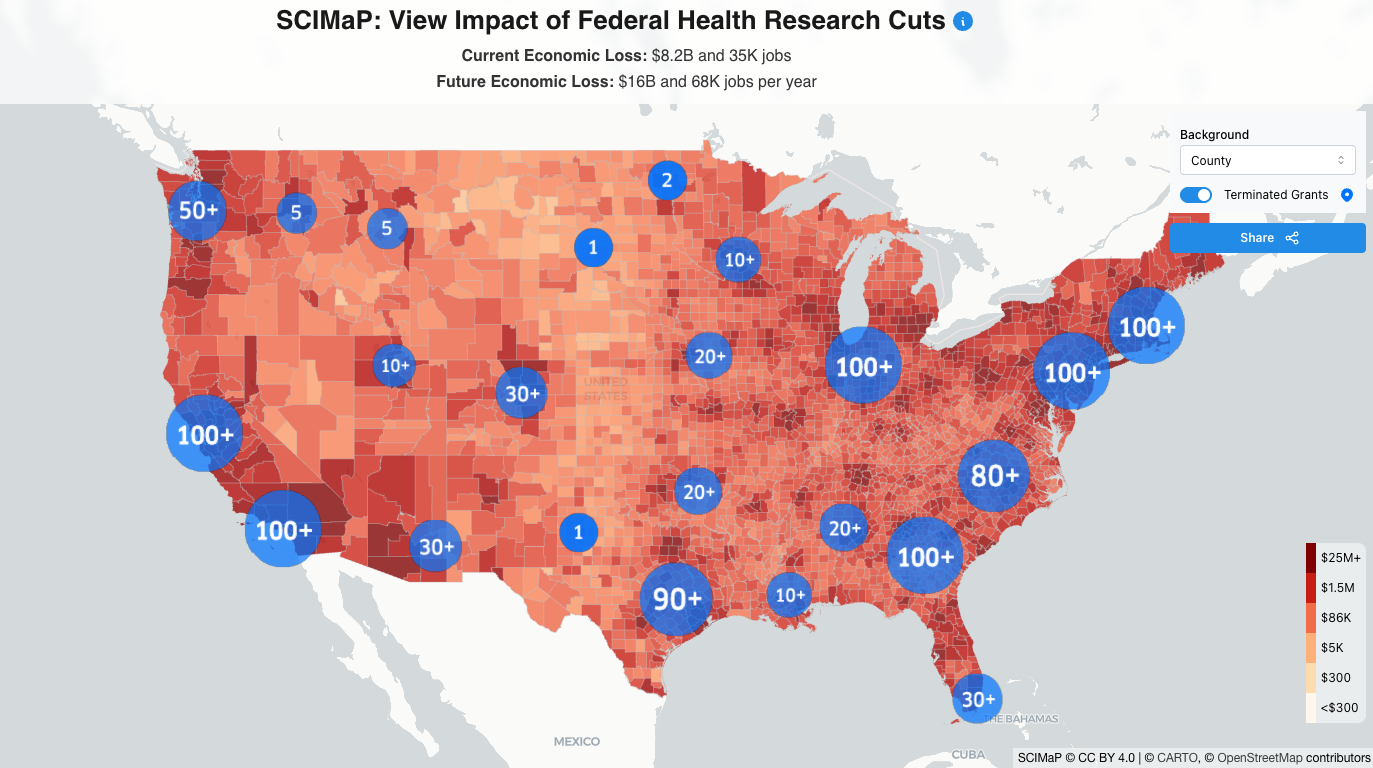
Researchers Alyssa Sinclair and Joshua Weitz have developed a map illustrating the local economic impacts of federal funding cuts to the National Institutes of Health (NIH). Released on March 27, the map provides state-by-state, district-by-district, and county-by-county analyses of the effects of reduced operating costs at NIH-funded facilities. The project originated from their collaboration during the COVID-19 pandemic, focusing on public health communications. The map highlights the consequences of slashing indirect cost rates, which support medical research infrastructure. Using fiscal year 2024 NIH grant data, the map estimates economic activity losses, showing that every $1 million in NIH funding supports approximately $2.5 million in economic activity. The interactive tool has garnered significant public interest, with over 50,000 website visitors in its first week. Users can visualize local impacts, prompting engagement by sharing screenshots with local representatives. The researchers acknowledge limitations, such as reliance on publicly accessible NIH data and variations in commuter flow data. Future updates aim to include terminated grants and thematic consequences related to medical research areas like cancer and heart disease.
— new from Association of Health Care Journalists